Propaganda Poster
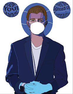
For this project, I decided I would do something relevant to the pandemic we have surrounding the Coronavirus. With it, I figured I would spread awareness of just how important it is to keep proper hygiene during a time like this. I created the poster using this:
It was using this image and the things we learned about text on Monday that allowed me to make the final poster shown above.


Feedback:
ReplyDelete1. Love how current this is!
I think your skills recreating yourself were awesome and done very skillfully.
2. I think the two circles with phrases could've done without, the mask over the face says it all!
Also the gloves to, it takes away from the coloring detail you added at first.
3. Such an awesome design and I think it was super successful!
This poster is great!! I did something similar to you where I created a poster relating to the corona virus. I love how you incorporated current issues with your poster. I think you could have maybe made the suit have a bit more contrast, but I think you did an amazing job. I would post this poster around haha.
ReplyDeleteThis turned out awesome, it looks so much like you!! I really like the color scheme and how the details came together on your face and on the left side of your jacket, it makes it so much more realistic! My only suggestion would be to maybe do more of that on the jacket. Overall this looks really great, good job!
ReplyDeleteI think you did a great job with this project because the cartoon aspect of your self looking extremely realistic. The only advice I would give you for this project would be to adjust the text on both sides of your body because they are pretty unclear to read. Just adjusting the font size a little bit will complement the picture greatly.
ReplyDeleteLOVE IT! I really like the style of your self portrait, as well as the colors!! Love the shadows and blocks of solid color used for them. I also like the propaganda part because it's damn relevant and definitely fits with the present state of things... I think if I had any recommendations it would be that I'd like to see more of that blue circle shape that you have in the bg, maybe repeated throughout the picture... but this is great I dig it!
ReplyDeleteI love the addition of the mask and gloves. That really plays well with the serious face your give off from your self portrait. I thought the typeface was a little hard to read at first. Did you do that to draw more attention to the rest of the image? I think the blue theme works really well with your suit jacket, the protective gloves, and spheres in the top of the image.
ReplyDelete