Logo
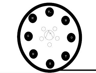
For my logo, I didn't just do something that I thought reflected me, I did something I'd been planning to do for a long time. As a filmmaker, I've always dreamed of creating my own production company. These dreams have only been dreams until recently--when a script I wrote entered preproduction. It was at that point that I decided it was time to start thinking of names and a general idea as to what to do for said production company. The name I had for the company was "Mt. Nothing." My original design consisted of a small, simple sketch of a mountain with the company name. Of course, this doesn't fully reflect who I am. In order to reflect more of who I am (including my love for filmmaking and hiking), I did these three rough logos:
Of course, these being rough sketches, they aren't COMPLETELY representative of the final logo. For the final logo, I went with the third design and fleshed it out more:
Black & White
I decided it would be best if I cut the words off the logo. It's often that the best logos are the ones where you can immediately tell what it is/what the company does. Another thing about the lack of words: I thought that since I'm generally a quieter person, a simpler logo would also help fit my personality.


Comments
Post a Comment